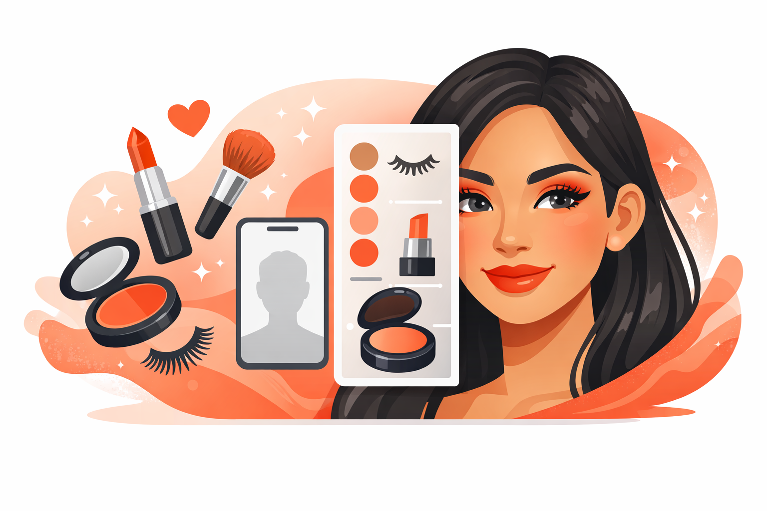
A Real WooCommerce Beauty Try-On Demo
This demo shows how shoppers can preview supported beauty products inside the browser using live camera mode or selfie upload, then choose products directly inside the app-style interface.
It is built to show how the try-on experience can feel inside a real product flow instead of looking like a disconnected tech demo.
Current Try-On Product Types
The live demo currently supports multiple beauty categories, all routed through the same app-based try-on experience.
Zoom, Preview, and Mode Controls
The interface is not just a filter overlay. It includes natural look controls, zoom states, source selection, and product-specific options for a cleaner shopper experience.
Full View
Shoppers can preview the result full face before moving into a more focused zoom view.
Zoom Views
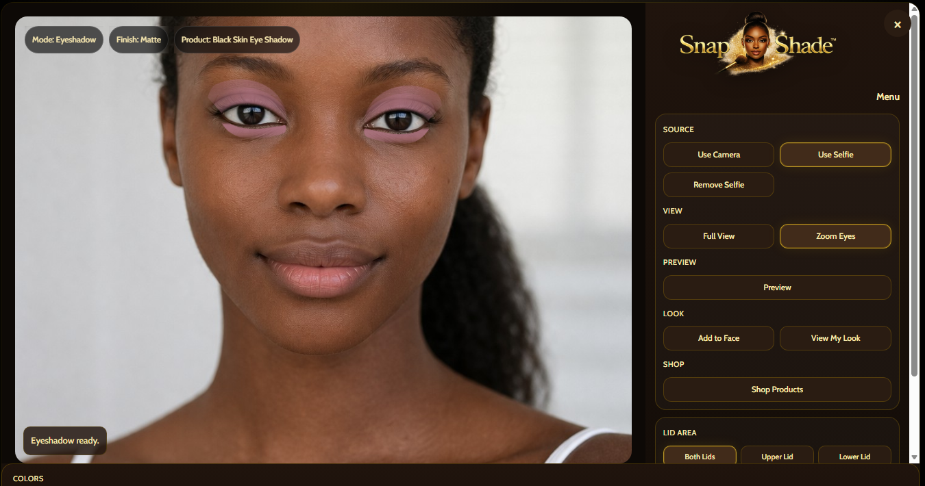
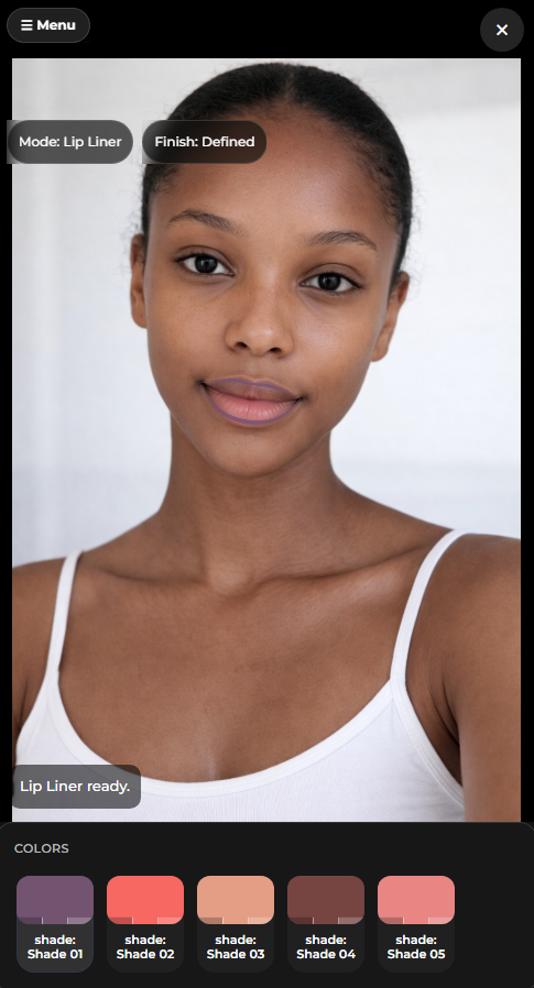
Lip and eye categories can use closer views so color and line work are easier to inspect.
Natural Look Toggle
Preview mode helps the shopper compare the result in a softer or more visible presentation state.
Built Around the Actual Try-On Interface
The demo interface includes real product controls, preview states, zoom views, natural look toggles, and product-specific options instead of generic mockup filler.
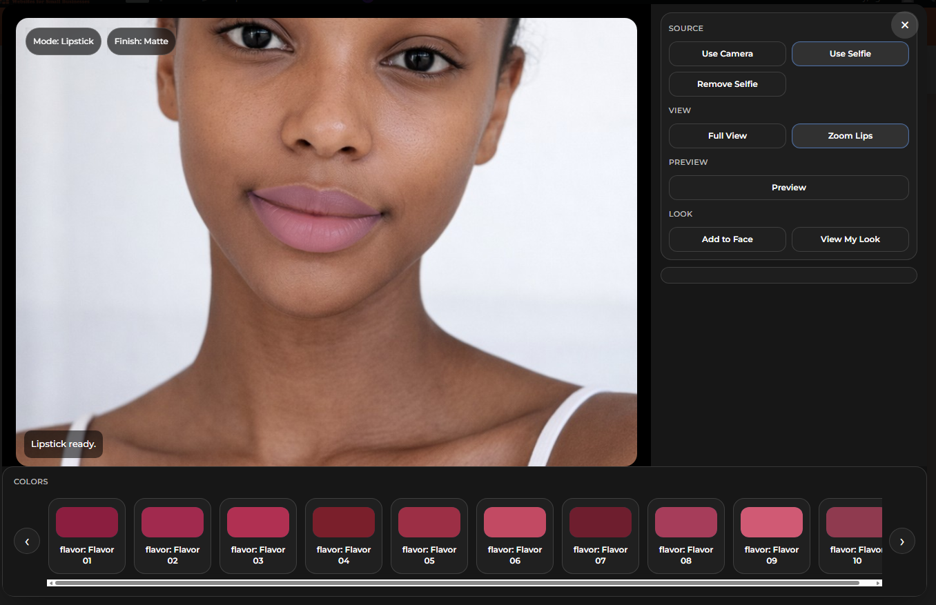
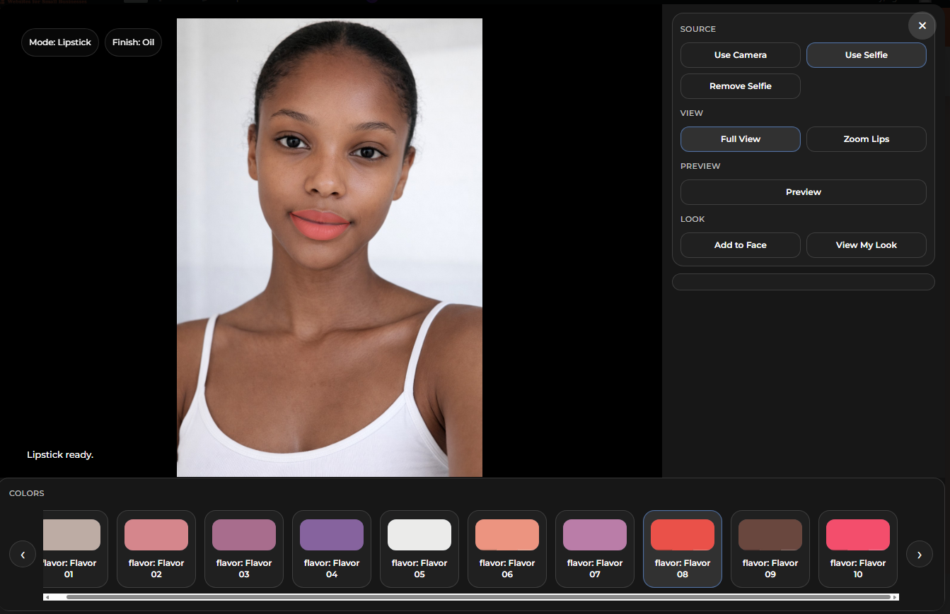
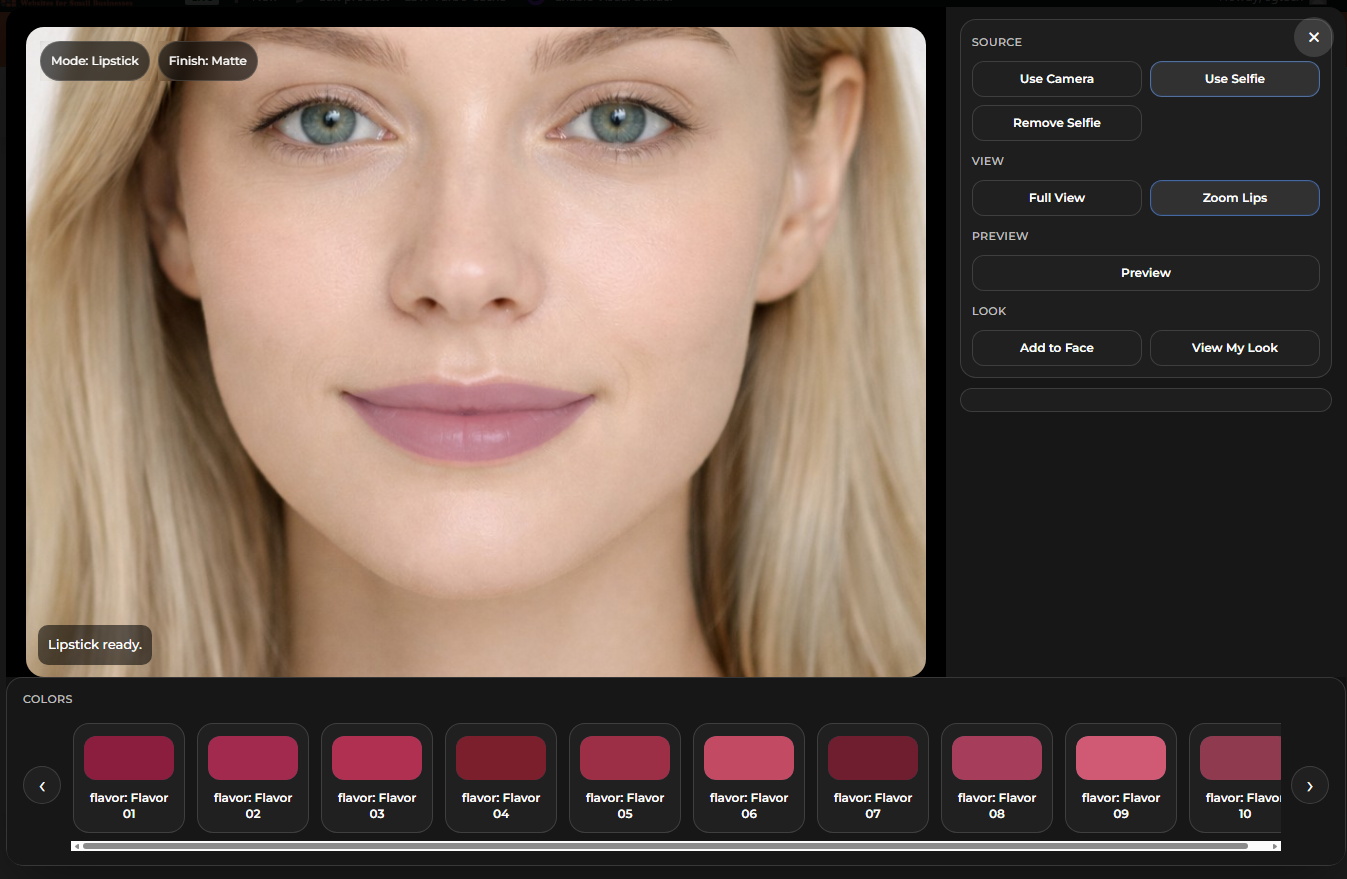
Lipstick Demo
The lipstick flow supports live preview, natural look mode, full view, zoom lips, and shade selection inside the modal.
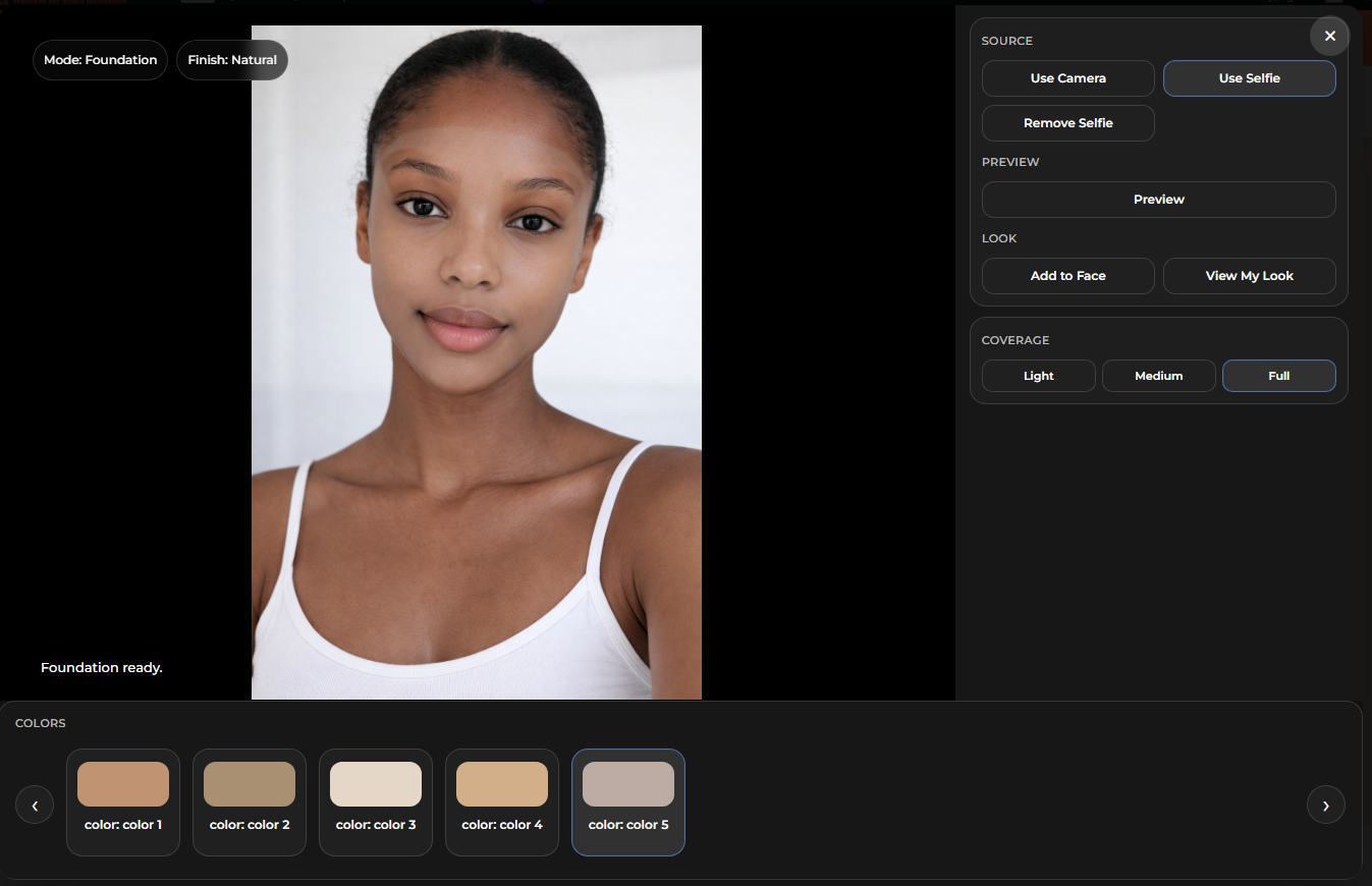
Foundation Demo
Foundation previews include shade options and coverage controls so complexion looks can be tested directly in the demo.
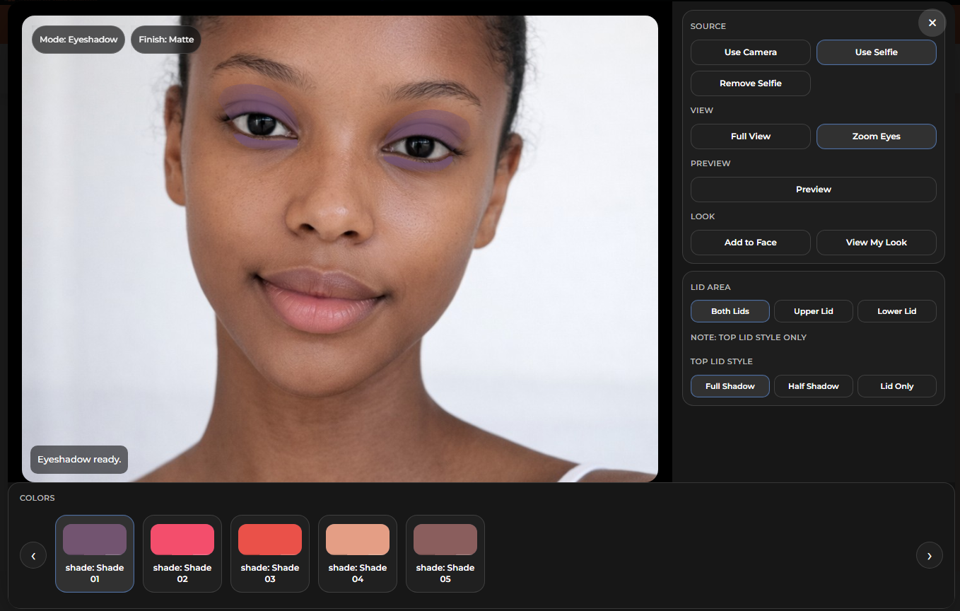
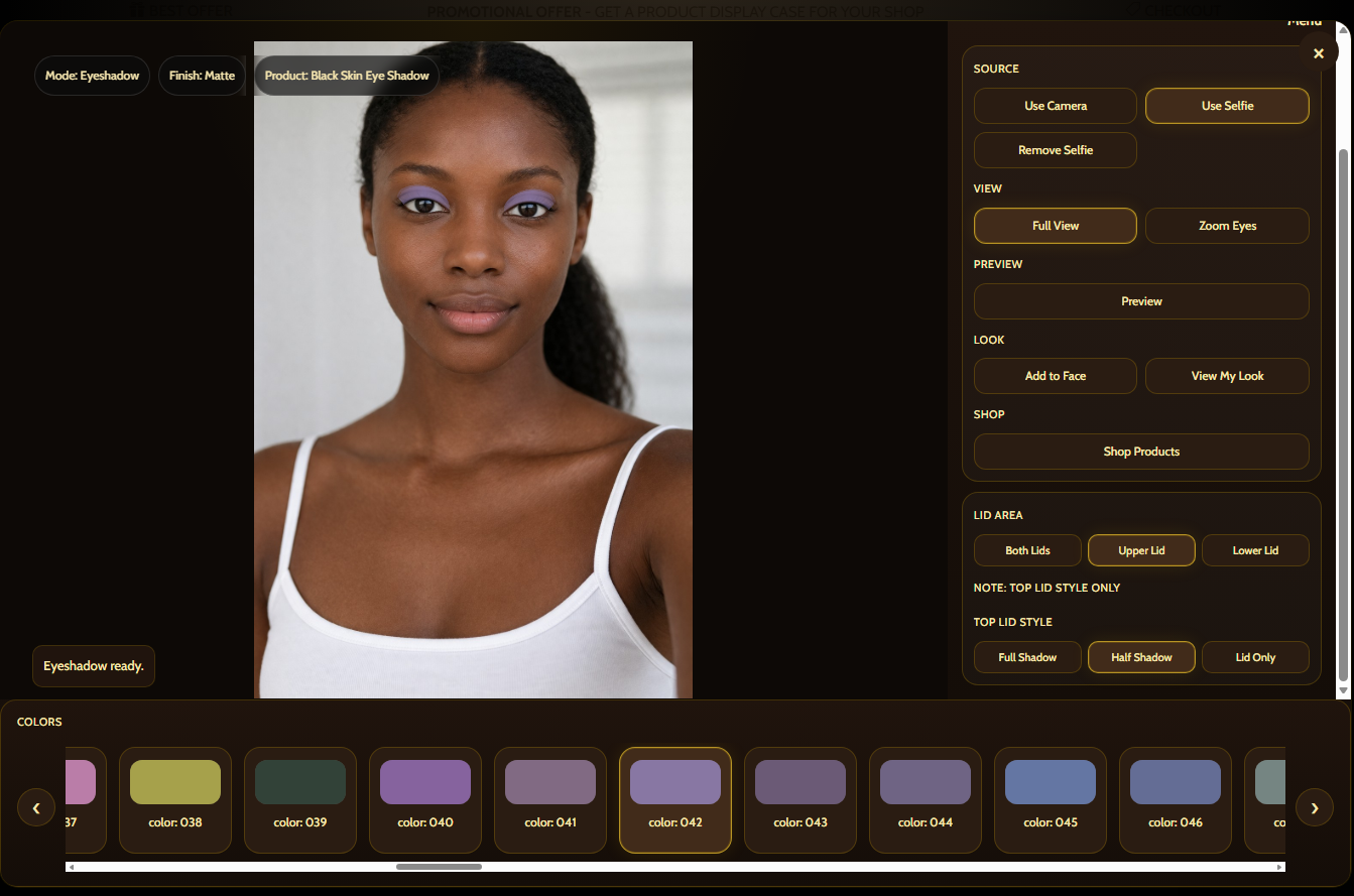
Eyeshadow Demo
Eyeshadow supports lid area controls, multiple style options, and shape states for different overlay looks.
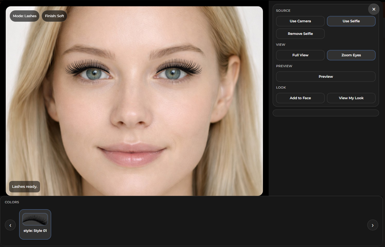
Lashes Demo
Lash styles can be previewed using the same front-end workflow with focused control and real modal presentation.
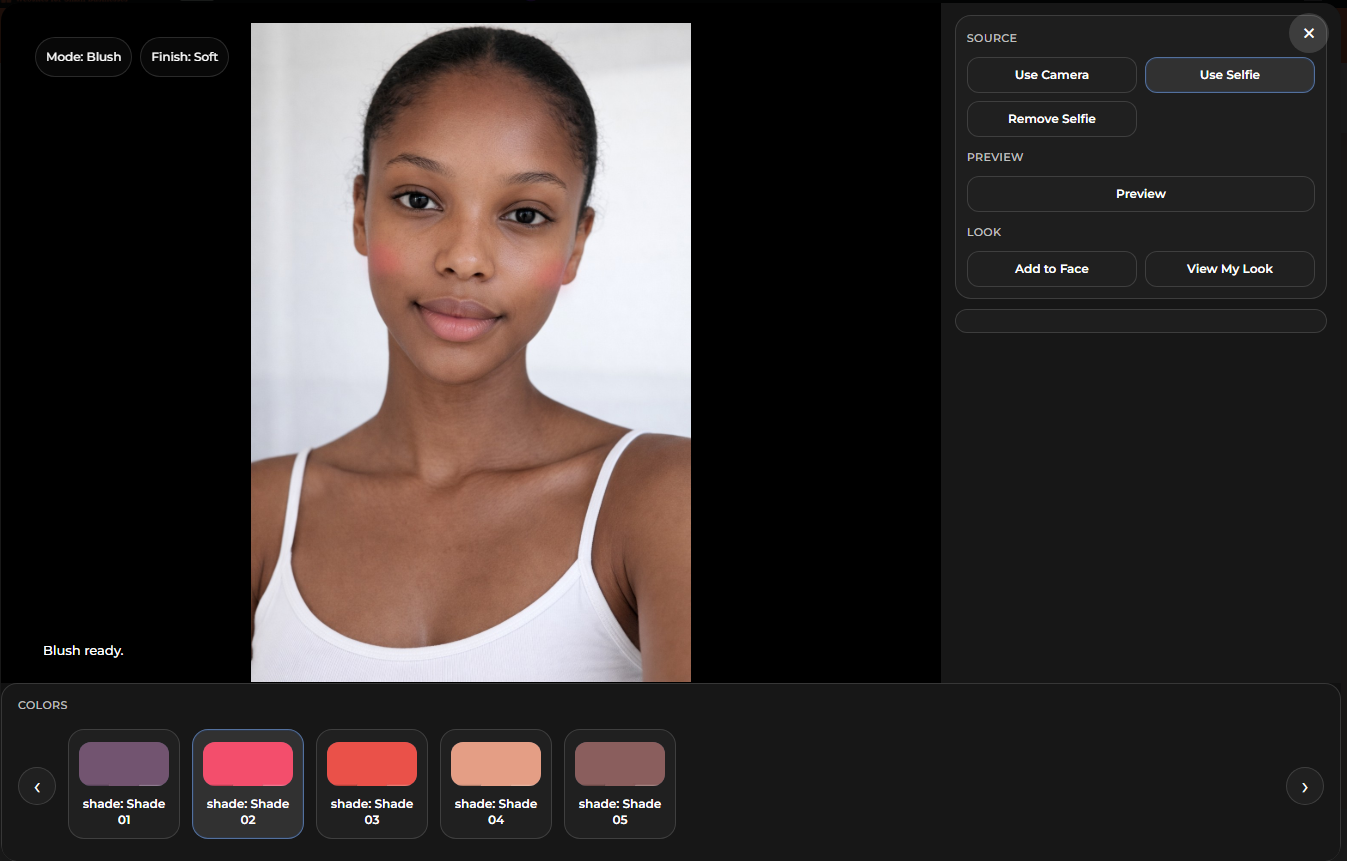
Blush Demo
Blush is shown on different model examples so the shopper can see how shades and placement behave across looks.
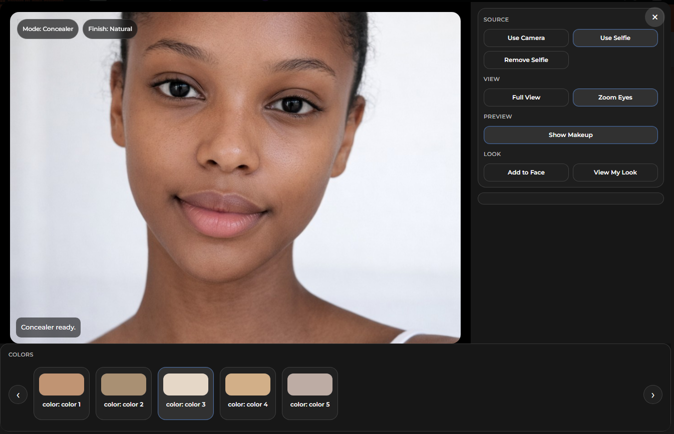
Concealer Demo
Concealer previews use the same in-app workflow so complexion categories stay inside one consistent AR experience.
WooCommerce product structure and variation-driven setup.
LBW AR Try-On for WooCommerce is built to work from the WooCommerce backend, which means the front-end demo is tied to normal product setup instead of being treated like a disconnected effect layer. That matters because store owners need something they can actually manage, update, and grow without rebuilding the whole experience every time a product changes.
At the product level, each supported item still starts as a real WooCommerce product. The title, short description, product image, gallery, category placement, and general store structure all stay part of the normal product workflow. From there, variation-based shade options, display colors, and supported try-on settings help control what the shopper sees inside the modal.
In practical terms, this means a lipstick can carry its own shade list, a foundation can carry complexion options and coverage behavior, and an eye product can expose more detailed view states without forcing the entire store into one rigid setup. The try-on is meant to respect what the product actually is instead of pretending every item works the same way.
This also makes the demo easier to maintain. When a store owner adds or edits supported shades, updates swatches, revises product copy, or changes which options should appear, those changes can be organized from the backend structure rather than hacked directly into the front-end display. That is a much more realistic way to run a working ecommerce site.
The variation setup is especially important. A product can use clear option naming, matching color tiles, and organized shade entries so the customer sees a cleaner shopping path. When the backend is messy, the front-end feels messy too. When the backend is clean, the try-on feels more believable and more professional.
For beauty stores, that means product setup is not just an admin chore. It directly affects the customer experience. Shade names, variation order, swatch colors, and product media all help shape whether the shopper trusts what they are seeing inside the try-on window.
This is why the WooCommerce side of the project matters so much. The try-on experience does not sit alone. It depends on real product organization, supported variation logic, and store-ready product data that can carry across categories like lipstick, lip liner, foundation, blush, concealer, eyeliner, eyeshadow, and lashes.
In a more advanced setup, that same foundation also makes it easier to support branded product flows, internal shopping steps, and app-style browsing patterns without throwing away the normal WooCommerce product structure underneath. The goal is not a flashy one-off demo. The goal is a try-on system that fits into a real store and can keep making sense as the catalog grows.

Two levels of try-on presentation depending on the store build.
The core try-on experience can stay clean and practical in a basic layout, or go deeper with premium styling, branded product routing, and a more polished guided shopping flow.
Basic Demo / Standard Layout
Clean, neutral, product-focused presentation.
Premium / Branded Experience
Higher-end presentation with stronger product identity and guided shopping.
What a branded version can look like.
The branded version pushes the same try-on system into a more custom beauty-store presentation, including themed styling, logo placement, branded product entry points, and store-driven shopping actions.

Homepage Entry
A branded site can launch the try-on from a visible homepage action such as a floating View My Face button.
Product Page Trigger
The branded version can tie the try-on directly into the product page with a custom branded try-on button.
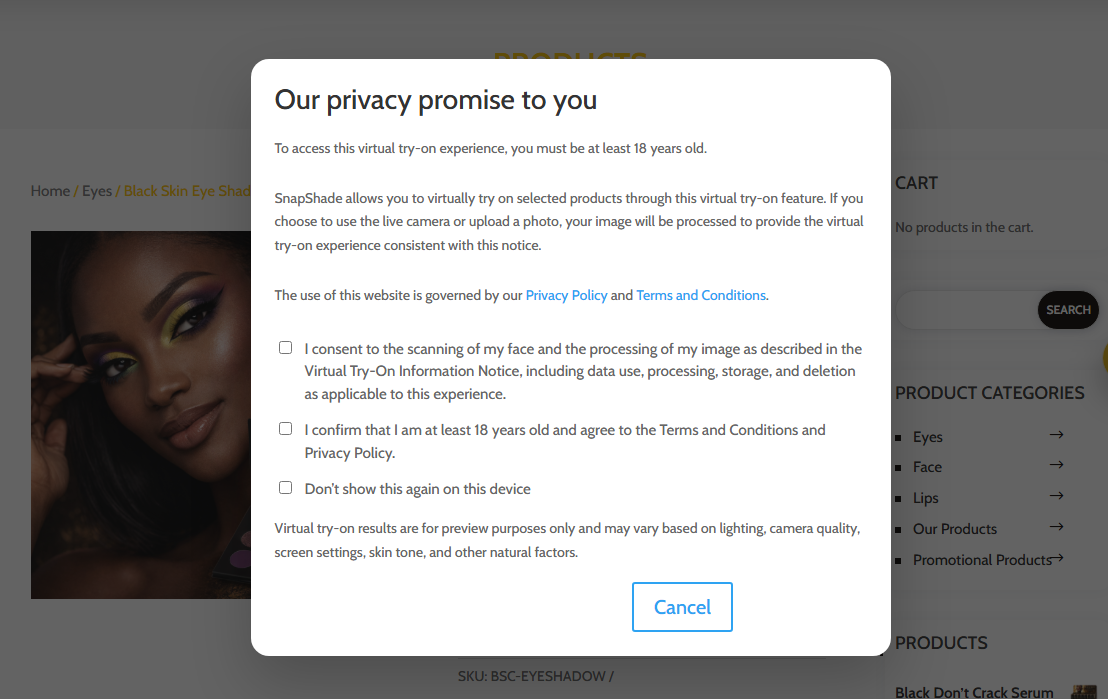
Consent and Notice Flow
A premium setup can include age confirmation, privacy notice language, and consent handling before the experience opens.
Branded Main Interface
The UI can be re-skinned into the store’s own visual direction while keeping the same underlying try-on logic.
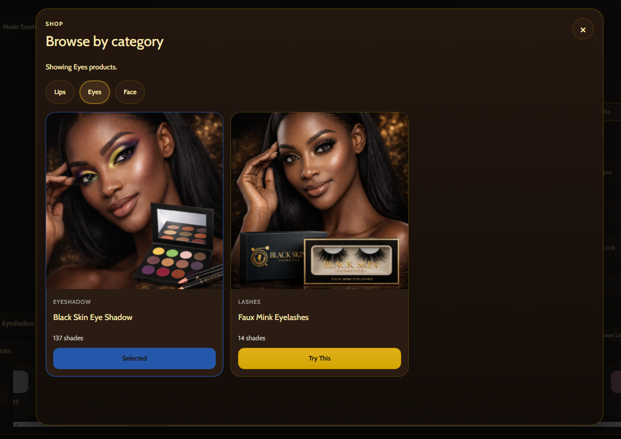
Shop Products Modal
Premium flows can let shoppers browse categories and supported products from inside the try-on interface itself.
Deeper Product Controls
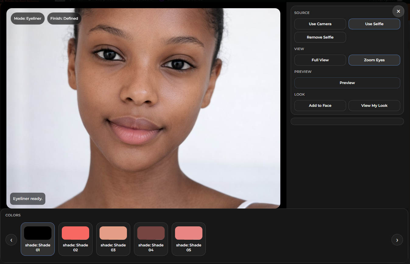
Branded eye products can expose more detailed control combinations while keeping the interface organized.

Desktop View My Look
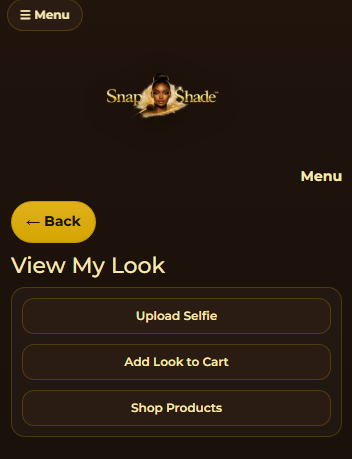
The combined look view can be turned into a branded review step with change-selfie, shopping, and add-look flow.

Combined Look Review
A more premium presentation can make the combined look feel like a real guided shopping stage rather than a side feature.
Separate mobile presentation, not just a squeezed desktop copy.
The demo also supports a more app-like mobile presentation, where controls move into menu and panel patterns that make more sense on smaller screens.
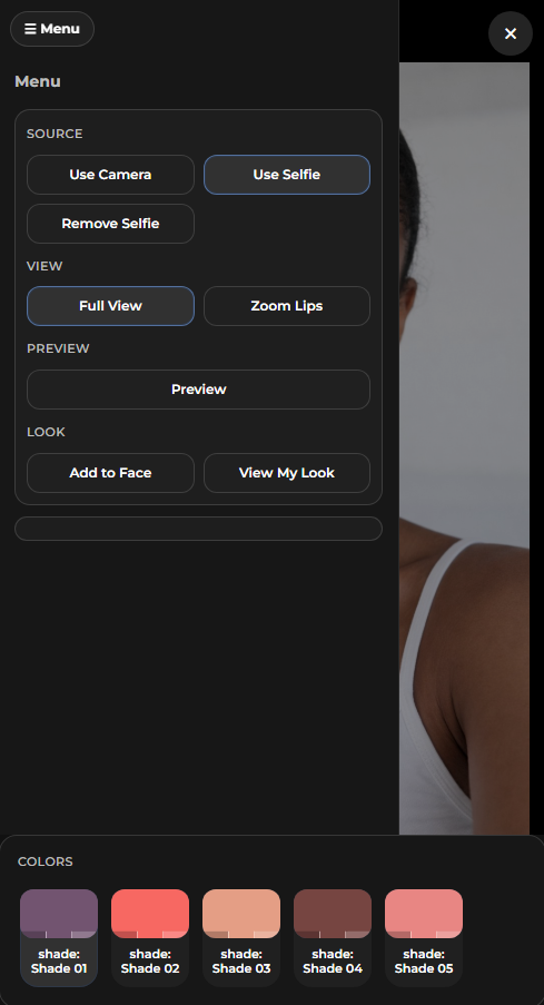
Mobile Menu Controls
The mobile version uses a menu-driven control pattern instead of forcing the full desktop sidebar into a cramped screen.
Focused Full-Screen Try-On
The shopper can stay focused on the face preview while shade controls live lower in the mobile screen flow.
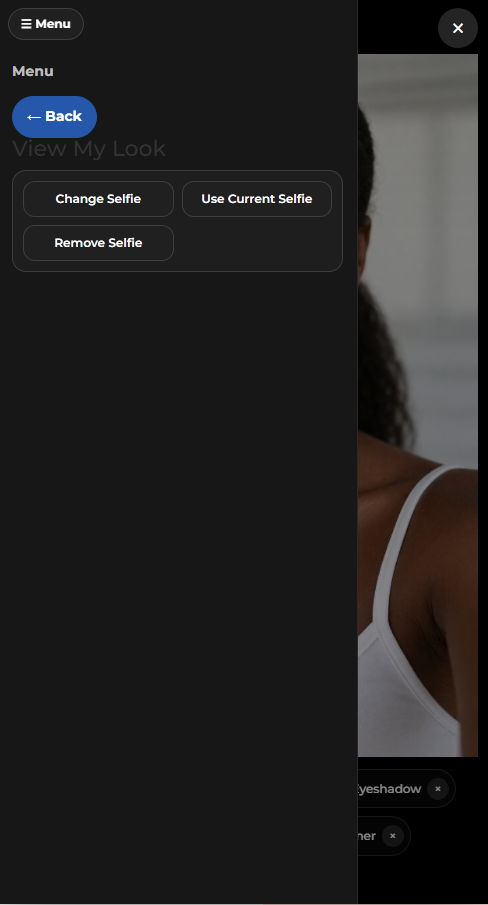
Mobile View My Look
The combined look screen can also shift to mobile-friendly actions like upload selfie, use current selfie, and shopping steps.
Combined Mobile Preview
On mobile, the combined look remains readable and product-linked instead of collapsing into a broken desktop leftover.
Branded Mobile Styling
Premium mobile builds can carry the same logo and visual identity treatment into the smaller interface shell.
Combined look review is part of the shopping path.
The system is designed so shoppers can place products onto the active face, combine them, and then review the full look instead of testing one isolated item at a time.
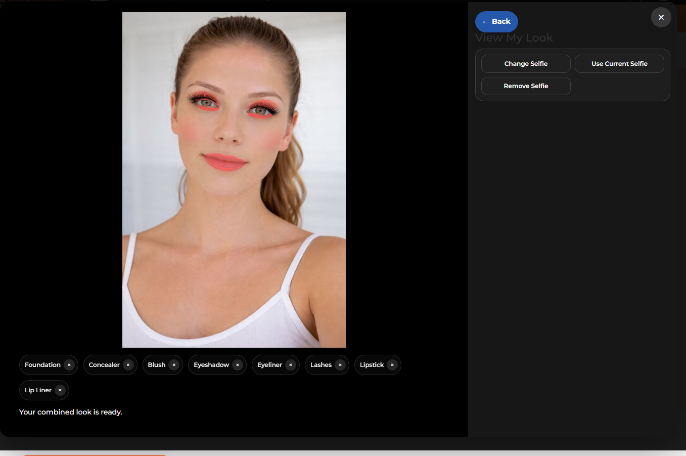
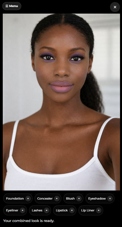
Desktop Combined Look
The shopper can review multiple active products together in one combined result.
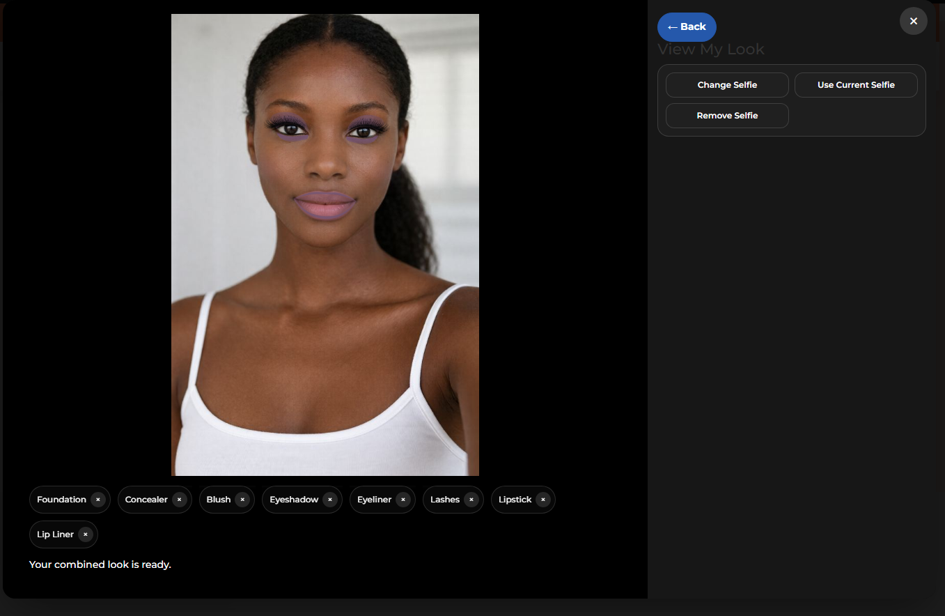
Multi-Category Layering
Foundation, concealer, blush, eyeshadow, eyeliner, lashes, lipstick, and lip liner can be shown in one finished look.

Selfie-Based Flow
The user can stay inside selfie-based review instead of needing the live camera for every try-on session.
Suggested backend short descriptions and purpose notes.
These are the kinds of short descriptions and product notes that fit the try-on product structure shown in the WooCommerce setup.
Short description pattern
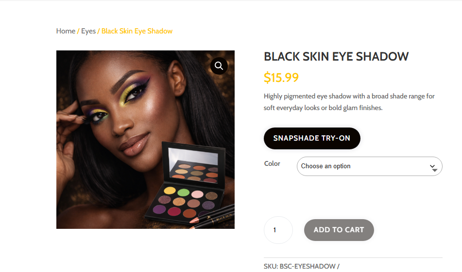
Keep the short description clear and product-led. Example: “Highly pigmented eye shadow with a broad shade range for soft everyday looks or bold glam finishes.”
For lipstick: “Smooth color payoff with buildable finish options for everyday wear or stronger statement looks.”
For foundation: “Blendable complexion coverage with multiple shade options and a cleaner product preview path.”
For blush: “Soft cheek color with buildable tone options designed for natural glow or stronger color pop.”
Variation note pattern
Keep variation naming practical and consistent. Shade 01, Shade 02, Shade 03 is fine for demos. On live stores, that can be swapped for real shade names.
Color swatches should match the closest real product tone possible because the try-on flow becomes more believable when the product list and preview colors line up.
Backend organization matters. The cleaner the product data is, the easier it is for the front-end try-on to feel polished instead of patched together.
Ready to Test the Demo?
Open the try-on app to choose a product, test shades, switch between live camera and selfie mode, and explore the supported beauty categories.